COVID-19 World Countries Comparision
by Laszlo Kiraly 09227679 and Gerald Weber 0125536
Based on the paper A 3D Visualization of Multiple Time Series on Maps published by Sidharth Thakur and Andrew J. Hanson in 2010, we created an interactive world view that allows the user to explore the spread of COVID-19.
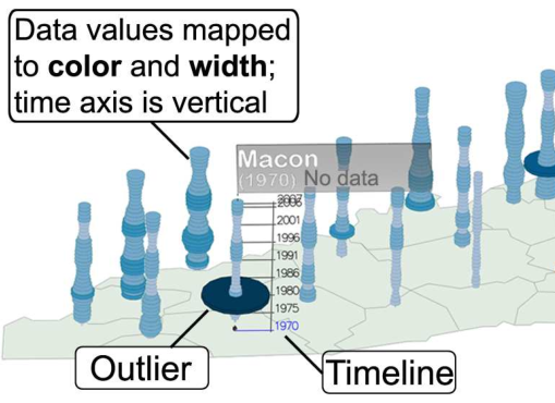
The suggested tool for comparison of multiple time series is a so called 3D vase which is a glyph that has the timeline on the y-axis and rings representing the value per point in time. But this representation has some disadvantages:
- glyph is only representing one value and
- glyphs can overlap.
The paper suggest a second, 2D visualization to compare multiple values with each other:
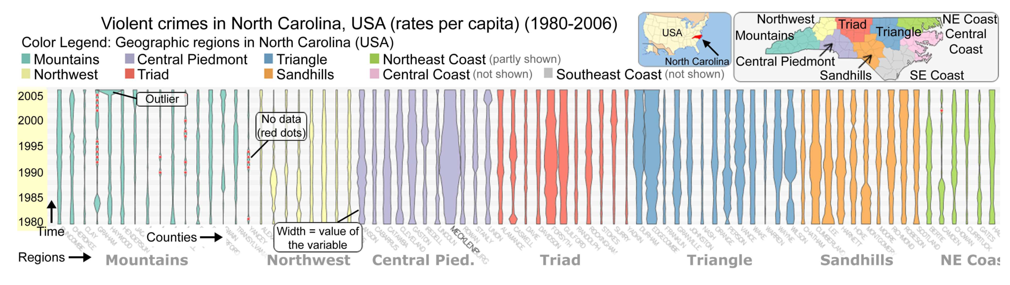
The depth of view is missing here, but it is very easy to compare different values against each other.
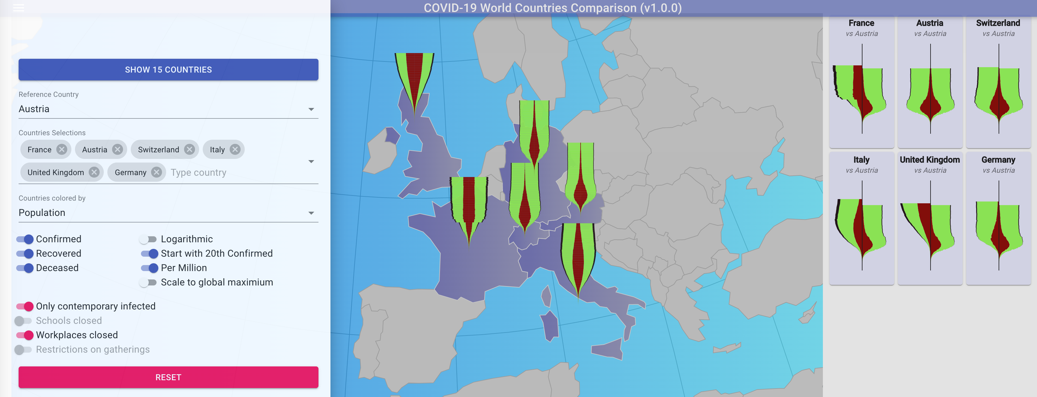
To get the best of both visualizations, we implemented COVID-19 World Countries Comparision.

The visualization is split into an interactive 3D world view, where multiple 2D glyphs can be displayed, and a 2D comparison pane where only the glyphs of the selected countries are displayed.
To customize the view, an option pane can be opened in the top left corner.
The combined presentation of 3D map and glyphs of selected countries, gives the user the opportunity to explore the dataset in a easy and natural way.
Implementation
Frontend
To implement the COVID-19 World comparison we used Javascript libraries React and D3JS. To improve developer experience we used Typescript as much as possible. React helps us with structuring the code, while D3 creates the world sphere and the glyphs.
Preprocessing
We also used Typescript here. The size of the datasets are relatively small (several MBs) and are processed in a couple of seconds.
What has been preprocessed: The GEO JSON containing the multipolygons for drawing the countries on the sphere has been enriched with population, centroids for countries, GDP and the timeseries for drawing the glyphs.
References
S. Thakur and A. J. Hanson, "A 3D Visualization of Multiple Time Series on Maps," 2010 14th International Conference Information Visualisation, London, 2010, pp. 336-343, doi: 10.1109/IV.2010.54. Download
Timeseries datasets: confirmed, recovered, deceased
Lookup table to synchronize between country labels used in GeoJSON and Timeseries